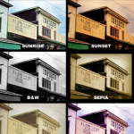
Posted by: Dave in Fireworks
The fine community over at Fireworks Guru Forum help each other out on a daily basis. One of the members posted links to a few of their own tutorials today, and they show some really good techniques.
Here’s a great tutorial on drawing flowers using the Star autoshape, and here’s another for creating flames using the wave gradient and a few curves filters. Here’s what I drew using these tutorials:

Flower drawn with Adobe Fireworks Autoshape

Flames drawn with Adobe Fireworks
No Comments »
Posted by: Dave in Projects
I recently helped design and build a web site announcing the new book Gen Buy by Dr. Kit Yarrow (my colleague from Golden Gate University) and her co-author Jayne O’Donnell.
They interviewed many members of Generation Y (also known as Millenials, people who have been born since 1980) and studied their influence on shopping and retail in America.
This complex generation can best be reached through a deep understanding of what makes them tick. In their ground- breaking book, they explore the psychological and social underpinnings of what Gen Yers want, why they buy, and how to best engage them. Gen BuY outlines practical suggestions for marketers on how to harness this group’s incredible buying power – and arms consumers with a better understanding of what triggers their own shopping and buying.
Check it out here – it is one of my rare forays into visual design and coding.

Comments Off
Estimating the value of design, particularly customer experience design, and the potential impact on conversion rates and revenue has always been difficult. It often requires making comparisons to past quarters or past years or simultaneously running different versions of the same site (e.g., traditional A|B testing), and it can be complicated by marketing campaigns and changes to advertising techniques and budgets than can alter the flow of traffic to a site.
The clever folks over at Teehan + Lax, a user experience consultancy based in Toronto, Canada, decided to gamble with $50,000 dollars of their own money to test a theory: companies that invest in customer experience design will have better revenue, greater customer satisfaction, and therefore perform better in the stock market. They selected 10 companies that are known for the use of experience design on their sites and held their stocks for 365 days, then they looked at the value of their UEX portfolio relative to the broader market indices. Their portfolio did very well:
“In the 365 days we owned our stocks the value of the portfolio increased 39.37%. This outperformed the major indexes (NASDAQ 18.09%, S+P 9.47%, NASDAQ 100 26.81%, NYSE 14.67%).”
Designing for the customer experience is not just for the good of the customer, it is also for the good of the company. Designing great customer experiences definitely has measurable value.
http://www.uxmag.com/strategy/327/investing-in-ux
Comments Off
As web sites and web applications become increasingly complex, they are also becoming decreasingly static. Web sites no longer present themselves as passive, static blocks of text and images. They move on their own and in response to user actions in order to:
- Capture attention (e.g., animated banner ads)
- Provide feedback after user actions (e.g., mouseover and on-click states)
- Provide deeper levels of information and facilitate understanding (e.g., infographics that illustrate complex data, such as planetary orbits)
Unfortunately, too much of this animation and motion is gratuitous and does not serve to enhance the user experience, and in many cases it actually distracts the site visitor. Usability professionals often encounter test participants who use their hands (or even sticky notes) to cover parts of the monitor where animated banner ads appear, because the ads attract their attention and distract from the content they are trying to read.
The animated GIF for banner ads that annoyed us for years before declining are being replaced by slicker Flash ads with embedded audio and video, elaborate animation, and even interactivity. Additionally, web sites and applications are using more motion and multimedia to add value to content and attract attention. In some cases the result is a sensory cacophony that overwhelms visitors and reduces the quality of the user experience.
Is animation bad? Should motion and multimedia be avoided? No, but we do need to consider when, where, and why we choose to use it. Animating a logo or image or infographic simply because we can is gratuitous. There should be value and improvement to the user experience, and the animation should support and enhance the content and goals of the site. Here are some basic principles for effective motion graphics and animation:
- Remember: motion attracts attention. Using too much animation and motion on a single page results in competition for attention and often frustrates visitors. If you choose to use motion to draw attention, give the visitor control and the ability to stop the motion if it distracts them from their goal.
- Animated graphics are only better than static graphics when they make it easier to understand complex information by being more visually explicit.
- The content and format of a graphic should closely correspond to the content and format of the concepts and information to be conveyed (also known as the Congruence Principle.) For example, it is more difficult to understand the variations in the stock market looking at tabular numeric data than by looking at diagrams of value over time. Animation adds the ability to include changes in time and space in a more visually explicit way.
- To be effective, animations need to be correctly understood by the viewer (also known as the Apprehension Principle.) Animations are often too complex or move too fast to be accurately processed and understood by visitors. Make the animation interactive, and give visitors the ability to pause, rewind, restart, and even control the speed or flow of the animation so that they can better focus their attention and thinking on the important and more complex portions.
- Avoid clutter and unnecessary complexity. Provide enough information and visual cues to help the visitor understand, but do not include extraneous information or design elements that may confuse or distract.
- Be organized and focused before starting to create the animation or motion graphics. Write a script, create storyboards, and have a plan to convey the information in a concise and focused way, otherwise you may wander away from the goal and include unnecessary information and/or steps.
- Use the animation to tell a story. A coherent narrative helps visitors better understand the information in a meaningful context.
- Support animations and motion graphics with corresponding text. Do not assume that the animations are sufficiently explicit to understand without supporting information. If you are using audio to support the animation, give the visitor the ability to control playback and volume.
- Consider using visual metaphors to help visitors better understand complex information and concepts and to reduce ambiguity.
- Avoid design myopia. You already understand the information and concepts, therefore your animation and motion graphics design will make sense to you. Show the animation to other people, test it with your target audience, and evaluate whether or not they understand it correctly. What seems obvious to you may be less so to others.
Comments Off